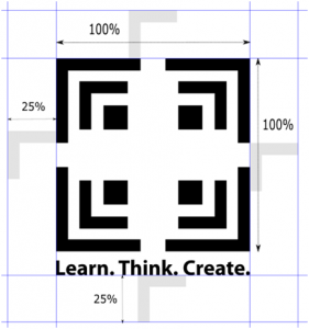
An exclusion zone around the logo has been created to protect its integrity. The height of the logo element that is 25% of the logo mark, as shown above, is taken as the guide to define the exclusion zone.
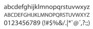
Font name for Roman Script: Myriad Pro Normal
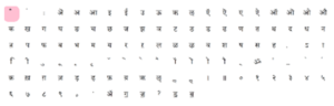
Font name for Devanagari Script: Kokila
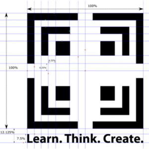
The relative ratios are to be maintained as shown above.
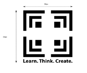
Digital: Minimum size: 30pixels(width)×34pixels(height inclusive of tagline text)
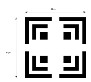
Favicon minimum logomark size: 16×16 pixels
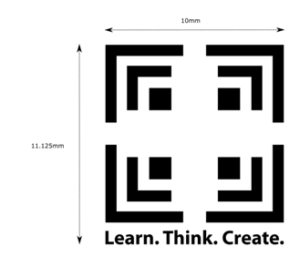
Print: Minimum size: 10mm(width)×11.125mm(height inclusive of tagline text)
Only monochrome logo with white or black background is recommended as shown below.

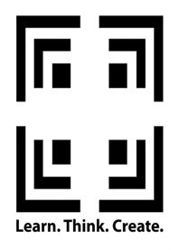
Horizontal logo with logotype:


Square logo with logotype:

Circular Logo with logotype:

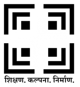
Devanagari Logo:
✕ Don’t Distort
✕ Don’t Move elements
✕ Don’t add elements

✕ Don’t remove any elements

✕ Don’t crop the logo

✕ Don’t rotate any part of the logo

✕ Don’t change the font or the font size

Badges:

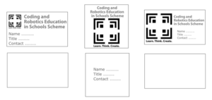
Visiting Cards: Recommended options for visiting cards are given below.
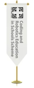
Pennants: