Logo Creation Process by the Creator of Logo
Miss Chinmayee Kalangutkar
Initial Versions
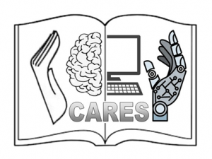
At the outset, the logo consisted of a half brain and half computer held in the cusp of one human hand and one robotic hand, which was surrounded by a book. But since the logo wasn’t simple and abstract, it was refined.
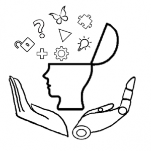
Then I had created a logo depicting a side profile of a human face with elements like plus signs, cogwheels and bulbs coming out from the mind.
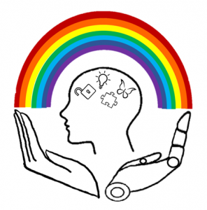
A version also had a rainbow surrounding it to symbolize the creation at the end of a creative storm of ideas.
The inspiration behind the final logo
It was then learnt that the logo was expected to be an abstract representation of the idea behind the project. The first thing that came to my mind when I thought of problem-solving was a maze. It was simple yet abstract. Since the logo was required to be visible as a 16×16 pixel icon, a square maze was drawn. I had read that there were 4 essential skills of the 21st century: Critical thinking, Communication, Collaboration and Creativity. These 4 C’s of the 21st century skills were incorporated into the logo through the 4 squares. The structure was then completed with another wall of the maze.
This led to the creation of the current logo which is small in size and an abstract conceptualisation since it communicates the spirit of the project symbolically without explicitly making use of any symbols.
Final Logo
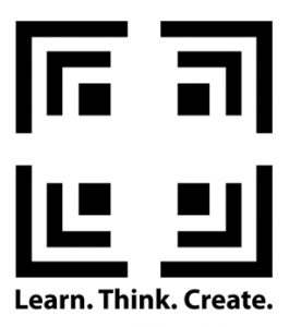
This logo is bounded by structure yet it has openness and freedom. It makes use of principles such as symmetry and closure. The 4 squares can recursively contain the logo within them, forming a fractal. The logo is so designed that in 3D, its Top view, Front view and side view are identical. It is also symmetrical around its centre as well as axis.
As regards the actual drawing of the logo, it had to be geometrically accurate in terms of proportions and lengths. As I wasn’t familiar with any professional designing software, I used Excel rows and columns of identical sizes and filled the individual squares with black to create the logo.
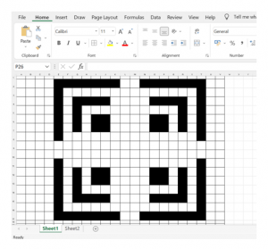
This itself is an example of making creative use of available tools to produce something despite constraints. So the creation of the logo itself happens to represent the theme behind the project.